In this article we will learn how to read graphs, credit split and how to use it to make a decision. Previous article explains the simplified part of the results page, what data is available, and how to interpret it and how to make a decision based on a measurement.
Result Measurement
The detailed results section will allow you to explore what was modeled prediction, and how the INCRMNTAL uses causal data science model reached the results.
The advanced section reveals the incrementality for the KPIs measured in the selected country and OS for your Organic results (non paid) , and the Total results (Organics + Paid) across every KPI measured.
In this article, when we refer to a "market", we refer to the combination of country and OS that is relevant for your measured entity.
e.g. measuring the impact of opening a campaign in ASA in the US, will utilize the KPI data in the market of US/iOS
The Causal Data Science Model visualizes your data (factual) as well as the predictive causal model (counterfactual)
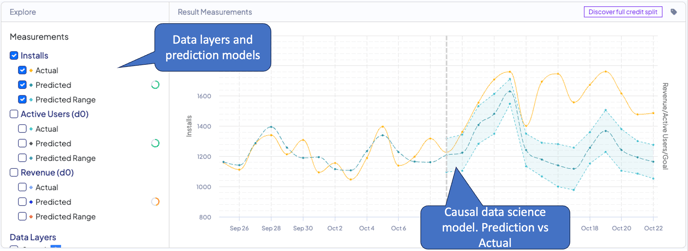
By default, the causal data science model graph presents the data for conversions. Clicking any of the measurements allows you to explore different measurements for other KPIs as provided with your data.
Once a goal is defined, the model is able to also create a prediction for your goal after the measured change. In this case, you’ll be able to view your benchmark, actual, and prediction based on your goal formula (CPI, CPA, ROAS, or custom).
Causal Data Science Model, Explained
To provide maximum transparency, the results screen featured a causal data science graph allowing you to explore what are the main parameters used for any measurement prediction.
Clicking the Measurements KPI checkbox will allow you to visualize the relevant, measured KPI. (remember: each KPI measurement test is an independent test).
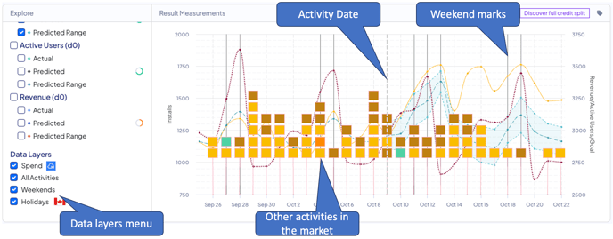
Clicking the Data Layers checkbox will allow you to overlay the graph with other significant logged marketing activities used in the measurement test, and the costs graph for the dimensions of the measured activity.
You can also overlay seasonality data such as weekends and holidays data.
Seasonality data in the actual model takes all historical data provided by your data integration.
The graph will present you with the factual data (as provided by your data integration), the model prediction (counterfactual), and a prediction confidence range.
The marketing activity date as measured is the treatment point, as marked with a dotted vertical line on the graph.
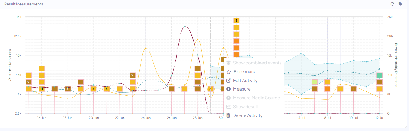
You can also measure other activities within the same timeline from the prediction graph, by clicking the flag and choosing ‘measure’!
To avoid false positives - The incrementality results represent only factual data that is above or below the prediction confidence range.
The confidence rage (pValue) INCRMNTAL operates by is 95%+
You can read more about "How does the platform differentiate results when there are multiple changes on the same day?" and Credit Split by the link.
For any question please contact support@incrmntal.com , or open a support Ticket here